Tailwind CSS with Next.js Image: A How-To Guide
Learn how to combine Tailwind CSS with Next.js Image to optimize your website's performance and provide a seamless user experience.
Learn how to combine Tailwind CSS with Next.js Image to optimize your website's performance and provide a seamless user experience.
Next.js provides an Image component with built-in optimization features, but styling it with Tailwind CSS can be challenging. This guide will explain how to integrate Tailwind CSS with the Next.js Image component for efficient and stylish image handling in your projects. We will cover two primary methods: using a wrapper div with Tailwind classes and directly applying Tailwind classes to the Image component (available in Next.js 13 and later). Additionally, we'll discuss important considerations such as aspect ratio, responsive design, and object fit to ensure optimal image presentation. By following these steps, you'll gain the ability to effectively style your Next.js images using the flexibility and power of Tailwind CSS.
While Next.js Image offers optimization benefits, styling it with Tailwind CSS can seem tricky. Let's break down the process:
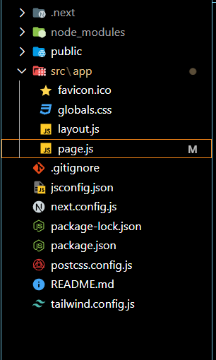
1. Project Setup:
2. Understanding the Challenge:
3. Approaches to Styling:
There are two main methods to style Next.js Image with Tailwind:
Method 1: Wrapper Div with Tailwind Classes
Image component within a div element.div to control its size, layout, and styling. The Image component will inherit these styles.<div className="w-48 h-48 rounded-full overflow-hidden">
<Image
src="/path/to/image.jpg"
alt="Image description"
width={192} // Maintain aspect ratio
height={192}
/>
</div>Method 2: Using className prop (Next.js 13+)
className prop for the Image component. This allows direct application of Tailwind classes to the image itself.<Image
src="/path/to/image.jpg"
alt="Image description"
width={192}
height={192}
className="rounded-full"
/>4. Key Considerations:
width and height props on the Image component to maintain the correct aspect ratio, even when using Tailwind classes for sizing.md:w-64) to adjust image styles at different breakpoints.objectFit prop on the Image component to control how the image fills its container (e.g., objectFit="cover").5. Additional Tips:
By following these steps and understanding the core concepts, you can effectively style your Next.js images with the power and flexibility of Tailwind CSS.
This code demonstrates two ways to integrate Tailwind CSS with Next.js Image component. The first method uses a wrapper div with Tailwind classes to style the image, while the second method directly applies Tailwind classes to the Image component using the className prop (available in Next.js 13+). Both methods ensure proper aspect ratio by setting width and height props on the Image component.
Here's how you can implement the two methods described in the article using JavaScript:
Method 1: Wrapper Div with Tailwind Classes
import Image from 'next/image';
function MyComponent() {
return (
<div className="w-48 h-48 rounded-full overflow-hidden">
<Image
src="/path/to/image.jpg"
alt="Image description"
width={192}
height={192}
/>
</div>
);
}
export default MyComponent;Explanation:
Image component from next/image.div with Tailwind classes for width, height, rounded corners, and overflow hidden.Image component is placed inside the div, inheriting its styles.width and height props on the Image component to maintain the aspect ratio.Method 2: Using className prop (Next.js 13+)
import Image from 'next/image';
function MyComponent() {
return (
<Image
  src="/path/to/image.jpg"
  alt="Image description"
  width={192}
  height={192}
  className="rounded-full"
/>
);
}
export default MyComponent;Explanation:
Image component.rounded-full class to the Image component using the className prop.width and height props for aspect ratio control.Remember:
objectFit for more control over image display.next-optimized-images or next-image-optimizer for further image optimization beyond Next.js's built-in capabilities. These plugins can offer features like automatic image compression and format conversion.blur utility classes can be helpful here.lazy class.react-responsive-carousel or react-image-gallery if you need more advanced image presentation features like carousels or lightboxes. These libraries often integrate well with Tailwind CSS.| Method | Description | Example | Next.js Version |
|---|---|---|---|
| Wrapper Div | Wrap Image in a div and apply Tailwind classes to the div. |
<div class="w-48 ..."><Image ... /></div> |
All |
className Prop |
Directly apply Tailwind classes to the Image component using the className prop. |
<Image ... className="rounded-full" /> |
13+ |
In conclusion, integrating Tailwind CSS with the Next.js Image component offers a powerful combination for building modern and efficient web applications. By understanding the challenges and available approaches, developers can effectively style images while leveraging Next.js's built-in optimization features. Whether using a wrapper div or the className prop, maintaining aspect ratio and considering responsive design are crucial for optimal image presentation. Additionally, exploring advanced techniques like blur-up effects, lazy loading, and accessibility considerations further enhances the user experience. By following the guidelines and best practices outlined in this guide, developers can create visually appealing and performant web applications that deliver an exceptional user experience.
 How to use Tailwind CSS with Next.js Image - DEV Community | Hello guys, hope you are doing well. In this post I am going to discuss how to properly use...
next/image Component. How to use Tailwind CSS with Next.js Image ? - GeeksforGeeks | A Computer Science portal for geeks. It contains well written, well thought and well explained computer science and programming articles, quizzes and practice/competitive programming/company interview Questions.
 How to use Tailwind CSS with Next.js Image? | by Prateek Pranveer ... | Next.js Image is a pre-optimized image component that is provided out of the box by Next.js. Tailwind CSS on the other hand, is a…